Analyzing Cell Colonies with Clickpoints
About this Tutorial
Using the pyTFM clickpoints addon requires a complete installation of clickpoints. If you have set up clickpoints correctly, you can open images by right clicking on the image files and select “open with clickpoints”.
You can find a small example data set, which is used during this tutorial, here. The data is in the subfolder “clickpoints_tutorial”. This data set contains raw data for 2 types of cell colonies: In one group a critical cytoskeletal protein has been knocked out. We will compare these cell colonies to a set of wildtype colonies. The raw data, in the form of images, is contained in the subfolders “WT” and “KO”. All output files, databases and plots as you should produce them in the course of this tutorial are stored in the folders “KO_analyzed”, “WT_analyzed” and “plots”. Use these folders to check if your analysis was correct.
The Data
As you can see in Fig. 1, there are 6 images for each colony type. This corresponds to two field of views for each wildtype and KO. For each field of view there are 3 images. One image (e.g. 03bf_before.tif) shows the colony and the boundaries between cells. In this case the image shows fluorescence stained cell membranes. The other two images show beads that are embedded in the substrate that the cells lie on. One image was recorded before the cells were removed (03before.tif) and the other was recorded after the cells were removed (03after.tif). The number in front of the filename (“03”, “10” and so on) indicates which field of view that image belongs to.
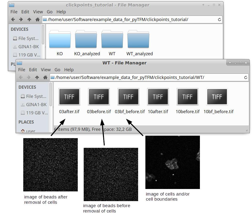
Fig. 1 Data structure of a Traction Force Microscopy experiment.
Opening Clickpoints and sorting Images
The first step to analyze the data is to create a clickpoints database, in which the images are identified correctly, concerning their type (whether it’s an image of the cells or an image of the beads before or after cell removal) and concerning the field of view they belong to. We are going to start with the wildtype data set. To open a database simple right click on an image and select “open with” –> “clickpoints”. The option to open with clickpoints might also be visible directly after you right clicked.
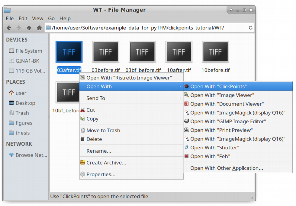
Fig. 2 Opening images with clickpoints.
Clickpoints sorts images in two dimensions: Frames and layers. The frames are displayed in the bar at the bottom. You can skip from frame to frame using the left and right arrows on your keyboard. Layers can be changed with the “Page Up” and “Page Down” keys. When you open the database, you will notice that there is only one layer and every image is sorted into a new frame. Our goal is to sort each field of view into one frame, with three layers per frame, each representing one type of image. In order to do this you need to open the pyTFM addon and open the “select image” menu. Follow the steps described in Fig. 3.
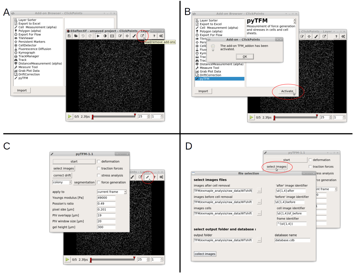
Fig. 3 A: Open the addon-browser in clickpoints. A new window, with all available addons will open. B: Activate the pyTFM addon by selecting pyTFM and clicking the “Activate” button. A window notifying you that the addon has been loaded successfully will appear. After you press “OK” a new icon will appear in the clickpoints main window to the right of the addon-browser button. C: Click on this button to open the pyTFM addon. D: Finally, open the menu to select images by pressing the “select images” button.
The “image selection” menu allows you to do three things: You can select where images are located and how they are classified. You can also set an output folder, where the database file and all analysis results will be saved and you can choose a name for the database. As mentioned above, the analysis requires three types of images. For each type you can select a folder (left hand side) and a regular expression that identifies the image type from the image filename (right hand side).
The default identifiers fit to the example data set, meaning that for now and in the future, if you are using the same naming scheme for your images, you can leave the identifiers as they are.
Note
Details on identifying images
The fields “‘after’ image identifier” and “‘before’ image identifier” are used to identify images of the substrate after and before relaxation. The field “cell image identifier” is used to identify images that show the cells or cell membranes. Finally, the “frame identifier” is used to identify the field of view each image belongs to. This must point to a unique part of the image filename, which is not limited to numbers. The part must be specifically enclosed by brackets “()”. Note that the extension (“.png”,”.tiff”, “.jpeg” …) must not be included in the identifiers.
Regular expressions are the standard way to find patterns in texts. For example, it allows you to identify numbers of certain length, groups of characters or the beginning and end of a text. You find more information on regular expressions here. Some useful expressions are listed in the table below:
| search pattern | meaning |
|---|---|
| after | all files with “after” in the filename |
| ^after | all files with “after” at the beginning of the filename |
| after$ | all files with “after” at the end of the filename |
| * | all files blank space also finds all files |
| ^(\d{1,4}) | up to 4 numbers at beginning of the filename |
| (\d{1,4}) | up to 4 consecutive numbers anywhere in the filename |
| (\d{1,4})$ | up to 4 numbers at end of the filename |
Once you have entered identifiers for image types, frames, the output folder and the database name press the “collect images” button. You should see something like this:
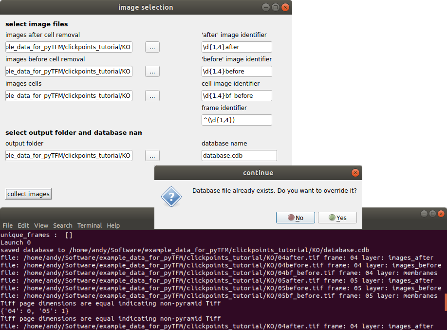
Fig. 4 Output of collect images.
Make sure your database didn’t contain any masks that you don’t want to delete. If you just opened the database from new images, you can press “Yes”. The path to the images that are sorted into the database, the type of the images (layer) and the field of view of the images (frame) are printed to the console. Make sure all images are sorted correctly. The program has generated a new clickpoints database file. Your currently opened clickpoints window updates automatically. You can close the “image selection” window now.
Correction of Stage Drift
Most often you will not manage to record exactly the same field of view when imaging the beads before and after cell removal. This will have an effect when you calculate the deformation field. In particular you will see your whole deformation field showing a bias to one direction. You can (and need to) correct this with the “correct drift” function (Fig. 5). This function will cut out the common field of view of the images of the beads before and after cell removal and shift one of the images with subpixel accuracy to match the other. The images of the cells will be cropped in the same way as the images of the beads.
First, go to the main pyTFM addon window and select “all frames” or “current frame” in the “apply to” option, depending on which frames you want to apply the drift correction to. Then press the “correct drift” button. You will see the drift in pixels in x and y direction printed to the console (Fig. 5, bottom).
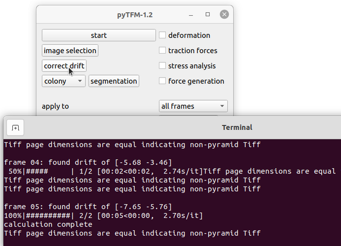
Fig. 5 Correction of stage drift.
Warning
This operation will permanently change you image files.
Setting Parameters
Lets continue with calculating the deformation and traction field. Go to the pyTFM addon window (Fig. 6).
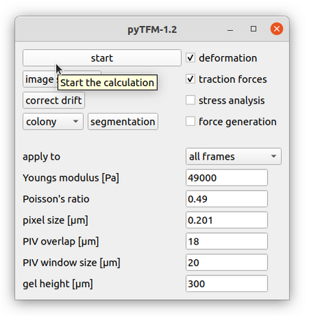
Fig. 6 Main addon window.
In this window you have to set the mechanical parameters of the substrate (“Youngs modulus” and “Poisson’s ratio”), the height of the substrate (“gel height”) and the pixel size (“pixel size”). Then you have to set two more parameters for the calculation of the deformation field. The deformation field is calculated with particle image velocimetry. This method essentially cuts out square shaped patches from the image of the beads before cell removal, places them on the image of beads after cell removal and checks how well they fit together. The vector from the original position of the patch to the position where the patch fits best in the image of beads after cell removal is the displacement vector. This is done for many positions to generate the complete displacement field.
You can control two things: the size of the patch that is cut out of the image of the beads after cell removal (with the parameter “PIV window size”) and the resolution of the resulting displacement field (with the parameter “PIV overlap”). A window size that is to large will blur the displacement field while a window size that is to small will introduce noise in the displacement field. As a rule of thumb the window size should be roughly 7 times the bead diameter - you should however try a few values and check which window size yields a smooth yet accurate deformation field.
Note
You can measure the beads diameter directly in clickpoints using another addon: The “Measure Tool”. It can be opened just like pyTFM from the addon browser
The “PIV overlap” mainly controls the resolution of the resulting displacement field and must be smaller than the “PIV window size” but at least half of the “PIV window size”. You need a high resolution for analyzing stress. In this step the area of cells should at least contain 1000 pixels. There will be a warning printed to the console and the output text file if this is not the case. However, if you are not calculating stresses, you can save a lot of calculation time by choosing a “PIV overlap” closer to half of the “PIV window size”. This is especially useful when you are for example trying out different window sizes or explore the influence of the gel height.
For this tutorial you can keep all parameters at their default value. If you are in a hurry you could set the “PIV window size” as low as 15 µm, and still obtain reasonable results.
Calculating Traction and Deformation Fields
Once you have set all parameters you can start the calculation: Use the tick boxes in the upper right to select which part of the analysis you want to perform. For now, we are gonna select only “deformation” and “traction forces”. Then use the “apply to” option to choose whether all frames should be analyzed or only the frame that you are currently viewing. Your window should now look like Fig. 6. Finally press “start” in the upper left to begin the analysis. With the default parameters this takes about 5 minutes per frame. “calculation complete” is printed to the console once all frames have been analyzed.
The traction and deformation fields are added to the database as new layers. Switch to these layers using the “Page Up” key on your keyboard. Traction and deformation for the first frame in the wildtype data should look like this:
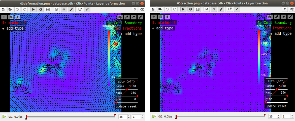
Fig. 7 Deformation and traction fields.
If you do not see the display tool and mask names (“Cell Boundary”, “Tractions”) on the right press F2.
Quantifying Force Generation
Force generation of the cell colony is quantified with the strain energy and the contractility. To avoid influence of nearby cells or noise, you have to select all tractions that are generated specifically by the cells that you are analyzing. You can do this by drawing a mask in clickpoints. In the top right of the clickpoints window you should see a set of tools to draw mask and two preset types of masks. If you don’t see these tools, press F2.
Hint
Tips for masks in clickpoints.
Select a mask and use the brush tool  to draw it. You can
increase and decrease the size of the brush with the “+” and “-” keys. If you want to
erase a part of a mask use the eraser tool
to draw it. You can
increase and decrease the size of the brush with the “+” and “-” keys. If you want to
erase a part of a mask use the eraser tool  . Additionally you can fill holes in your mask with
the bucket tool
. Additionally you can fill holes in your mask with
the bucket tool  . Mask types cannot overlap, which means that one mask type is erased when you
paint over it with another mask type. Sometimes you will have a hard time seeing things that are covered by
a mask. Press “i” and “o” to decrease and increase the transparency of the mask.
. Mask types cannot overlap, which means that one mask type is erased when you
paint over it with another mask type. Sometimes you will have a hard time seeing things that are covered by
a mask. Press “i” and “o” to decrease and increase the transparency of the mask.
The mask type used to calculate strain energy and contractility is called “Tractions”. Select this mask and draw a circle around all tractions that you think originate from the cell colony. Typically, the area you encircle is large than the cell colony itself. It’s not a big deal if your selection is a bit to big, but you should make sure not to include tractions that do not originate from the cell colony. You don’t need to fill the area you have encircle; This is done automatically. However, if you see the “no mask found in frame ..” warning message in the console, you should first make sure that there is no gap in the circle that you drew. I drew the mask like this:
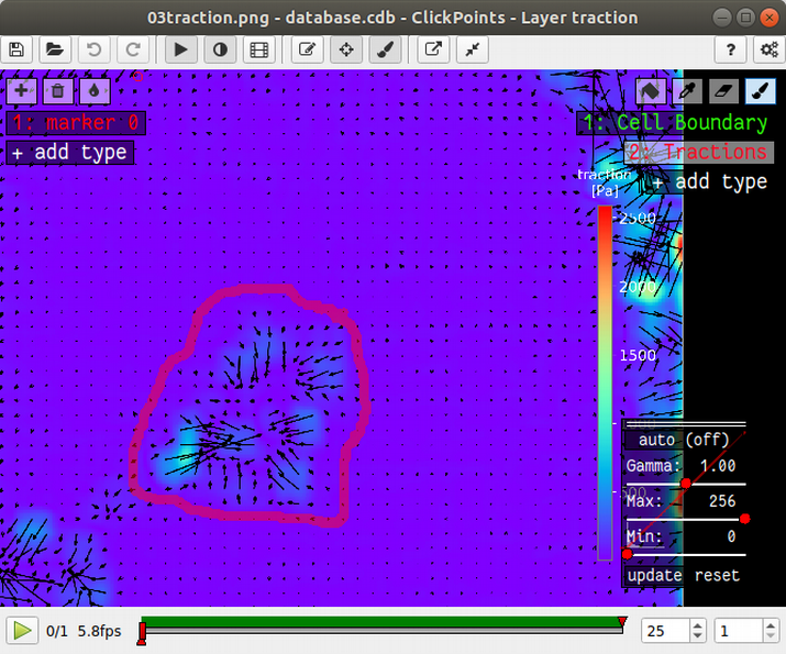
Fig. 8 Mask for quantification of force generation.
You could now press start again, and the program would generate a text file listing the contractility and strain energy for all frames. In order to be a bit more organized and get all results in one text file, we will first prepare to analyze stresses in the cell sheet at the same time.
Measuring Stresses, the Cell-Cell Force Transfer, counting Cells and measuring the Colony Area
Cellular stresses are calculated by modelling the cell colony as a 2 dimensional sheet and applying the traction forces that we have just calculated to it. Due to inaccuracies in the traction force calculation, namely that some forces are predicted to originate from outside of the cell sheet, the cell colony is modeled as a an area slightly extending beyond the actual cell colony edge. We have shown that stresses are calculated with the highest accuracy if this area covers all cell-generated tractions but does not extend significantly further than that. When in doubt, it is better to choose the area larger rather then smaller.
pyTFM uses the area that you just marked with the mask “Tractions” to model the cell colony. Stresses and cell-cell force transfer (quantified by the line tension) are however evaluated strictly on the inside of the cell colony. Thus you have to the edge of the cell colony to compute average stresses. To quantify the line tension, you have to also mark the internal cell-cell boundaries. Both is done with the Mask “Cell Boundary”; the program automatically distinguishes between internal cell-cell boundaries and the colony edge.
In the main window of clickpoints switch to the image showing the cell membrane using the the “Page Up” or “Page Down” key, select the mask “Cell Boundary” and mark all cell membranes.
Hint
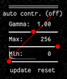
Press F2 and use the controls (see below) in the bottom right to adjust the contrast of the image. This might help you to see the membrane staining better.
Use a thin brush and make sure that there are no unintentional gaps. Also mark the outer edge of the colony. I drew the mask like this:
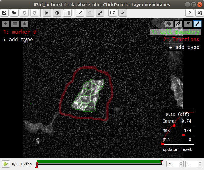
Fig. 9 Mask of cell membranes.
Hint
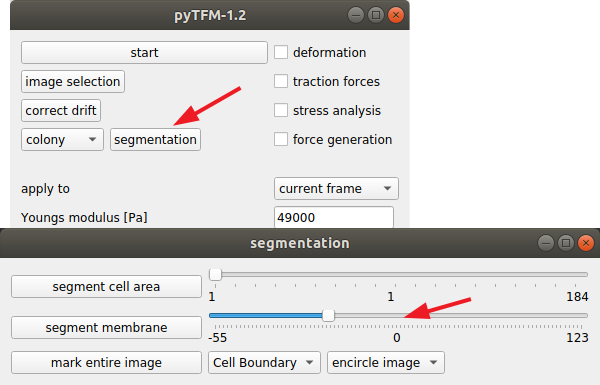
If there are a large number of cell boundaries, you can try the automatic segmentation tool of pyTFM. Press the segmentation button in the main window. The slider next to “segment membrane” allows you to control the segmentation sensitivity. The mask displayed in the clickpoints window will automatically be updated when you select a new value. You can apply this segmentation threshold to all frames by pressing the “segment membrane” button. Note however that this segmentation algorithm is rather primitive; the results may be poor, strongly depend on the quality of your images and will usually need some manual revision.
Once you have drawn all masks in all frames you are ready to start the calculation. Go to the pyTFM addon window, tick the check boxes for “stress analysis” and “force generation”, make sure you have set “apply to” to “all frames”, untick the “deformation” and traction forces” boxes and press start. The calculation should take up to 5 minutes.
After the calculation is complete two new plots will be added to the database. The first will show the mean normal stress in the cell colony and the second will show the line tension along all cell-cell borders. The outer edge of the cell colony is marked in grey. These lines are not used in the calculation.
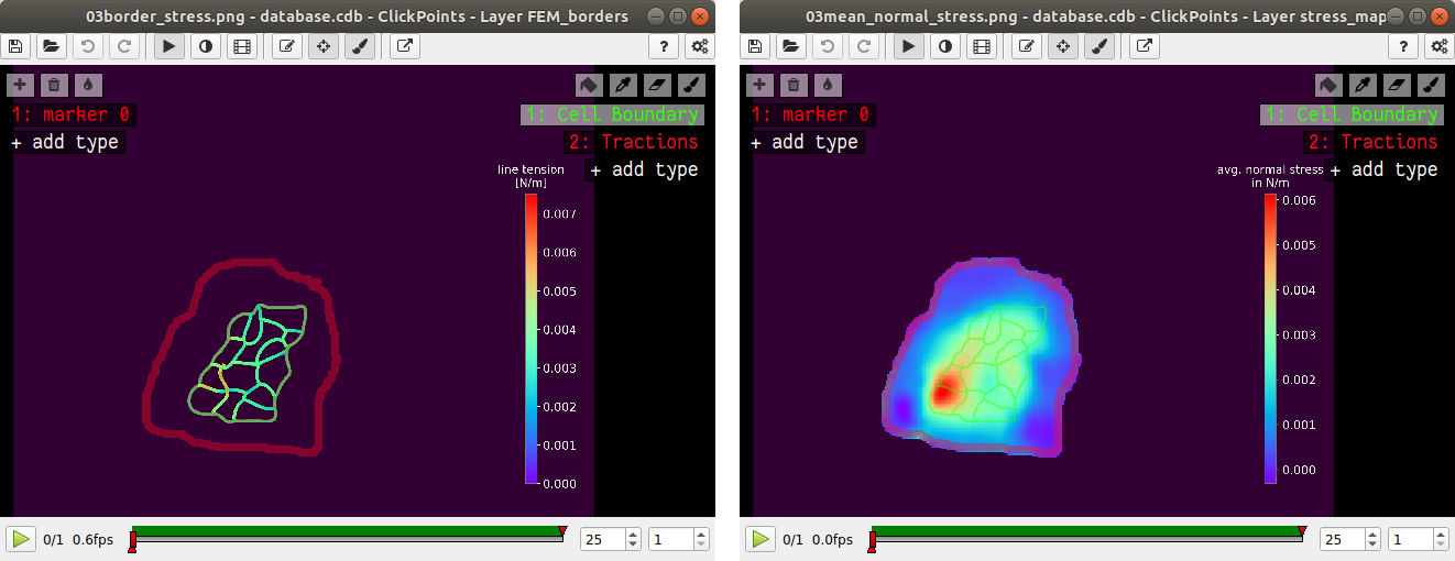
Fig. 11 Mean normal stress and line tension.
Note
A few notes on the calculation of stresses. The average stresses (average mean normal and average shear stress) and the coefficient of variation of these stresses is calculated by averaging over the true area of the cell colony, marked with the mask “membrane”. The mean normal stress should be high in areas where strong forces oppose each other. This can be seen in Fig. 11. Likewise, the line tension is high if strong forces oppose each other across the line. A high mean normal stress does not necessarily indicate a high line tension. It is better to look at the traction forces, when checking if the values for the line tension make sense.
Understanding the Output File
Every time you press start the program creates a text file “out.text” in the output folder. If such a file already exists, the text file is named out0.txt, out1.txt and so on. The output starts with a header containing important parameters of the calculation (Fig. 12). This is followed by a section containing all results. Each line has 4 to 6 tab-delimited columns, containing the frame, the id of the object in the frame (if you analyze multiple cells or cell colonies in this frame), the name of the quantity, the value of the quantity and optionally the unit of the quantity and also optionally a warning.
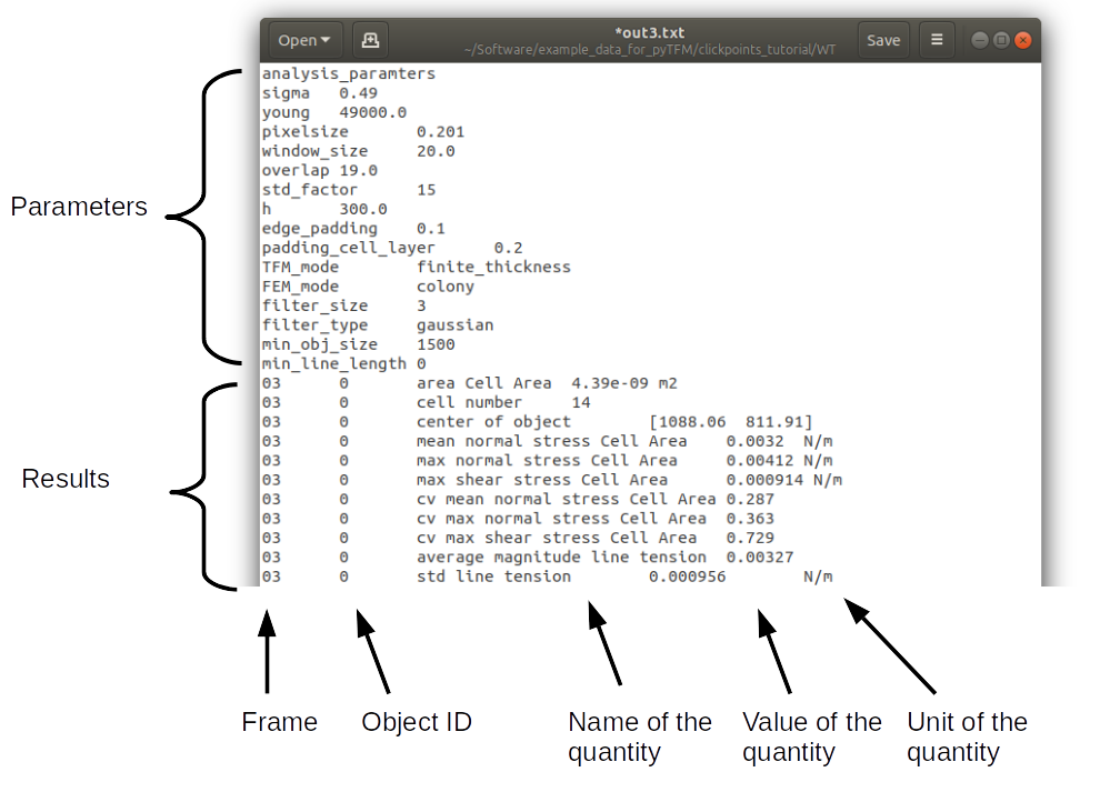
Fig. 12 The output file.
Warnings such as “mask was cut close to image edge” and “small FEM grid” should not be ignored.
Plotting the Results
Repeat the same analysis for the KO data set. Once you have the output text files for both data sets you could go ahead and use any tool of your choosing to read the files and plot the important quantities. Of course the best tool to do so is python: pyTFM provides its own python functions to read and plot data. The following code is also contained in the file “clickpoints_tutorial/data_analysis.py”. This file can be executed with python, however you must first edit the file paths for in- and output.
First lets import all functions that we need:
from pyTFM.data_analysis import *
Next, we read the output files from wildtype and KO data sets. This is done in two steps: First the text files are read into a dictionary where they are sorted for the frames, object ids and the type of the quantity. Then frames and objects are pooled to a dictionary where each key is the name of a quantity and the value is a list of the measured values. Note that our output text file for the last step should be called “out0.txt” if you followed the tutorial exactly.
# reading the Wildtype data set. Use your own output text file here
file_WT = r"/home/user/Software/example_data_for_pyTFM/clickpoints_tutorial/WT/out.txt"
# reading the parameters and the results, sorted for frames and object ids
parameter_dict_WT, res_dict_WT = read_output_file(file_WT)
# pooling all frames and objects together.
n_frames_WT, values_dict_WT, frame_list_WT = prepare_values(res_dict_WT)
# reading the KO data set. Use your own output text file here
file_KO = r"/home/user/Software/example_data_for_pyTFM/clickpoints_tutorial/KO/out.txt"
parameter_dict_KO, res_dict_KO = read_output_file(file_KO)
n_frames_KO, values_dict_KO, frame_list_KO = prepare_values(res_dict_KO)
We are going to use the dictionaries with pooled values (values_dict_WT and values_dict_KO) for plotting. First, let’s do some normalization: We can guess that a larger colony generates more forces. If we assume this relation is somewhat linear it is useful to normalize measures of the force generation with the surface area of the colony:
# normalizing the strain energy
values_dict_WT["strain energy per area"] = values_dict_WT["strain energy"]/values_dict_WT["area Cell Area"]
values_dict_KO["strain energy per area"] = values_dict_KO["strain energy"]/values_dict_WT["area Cell Area"]
# normalizing the contractility
values_dict_WT["contractility per area"] = values_dict_WT["contractility"]/values_dict_WT["area Cell Area"]
values_dict_KO["contractility per area"] = values_dict_KO["contractility"]/values_dict_WT["area Cell Area"]
Note that this only works if force generation and area were calculated for all colonies - this requires that you outline the colony with the mask “Cell Boundary”.
Now we can perform a t-test to identify any significant differences between KO and WT. We will do this for all quantity pairs at once and later display only the most important quantities. Unfortunately, due to the the fact that we analyzed only two colonies per data set you will find no significant differences in this case.
# t-test for all value pairs
t_test_dict = t_test(values_dict_WT,values_dict_KO)
Let’s produce some plots. First, we are going to compare some key quantities with box plots. The function “box_plots” expects two dictionaries with values, a list (“labels”) with two elements, which identifies these dictionary and a list (“types”) of quantities that you want to plot. Additionally, you can provide a dictionary containing statistical test results and specify your own axis labels and axis limits:
lables = ["WT", "KO"] # designations for the two dictionaries that are provided to the box_plots functions
types = ["contractility per area", "strain energy per area"] # name of the quantities that are plotted
ylabels = ["contractility per colony area [N/m²]", "strain energy per colony area [J/m²]"] # custom axes labels
# producing a two box plots comparing the strain energy and the contractility in WT and KO
fig_force = box_plots(values_dict_WT, values_dict_KO, lables, t_test_dict=t_test_dict, types=types,
           low_ylim=0, ylabels=ylabels, plot_legend=True)
We can do the same for the mean normal stress and line tension:
lables = ["WT", "KO"] # designations for the two dictionaries that are provided to the box_plots functions
types = ["mean normal stress Cell Area", "average magnitude line tension"] # name of the quantities that are plotted
ylabels = ["mean normal stress [N/m]", "line tension [N/m]"] #
fig_stress = box_plots(values_dict_WT, values_dict_KO, lables, t_test_dict=t_test_dict, types=types,
          low_ylim=0, ylabels=ylabels, plot_legend=True)
Another interesting way of studying force generation is to look at the relation between strain energy (a measure for total force generation) and contractility (measure for the coordinated force generation) This can be done as follows:
lables = ["WT", "KO"] # designations for the two dictionaries that are provided to the box_plots functions
# name of the measures that are plotted. Must be length 2 for this case.
types = ["contractility per area", "strain energy per area"]
# plotting value of types[0] vs value of types[1]
fig_force2 = compare_two_values(values_dict_WT, values_dict_KO, types, lables,
         xlabel="contractility per colony area [N/m²]", ylabel="strain energy per colony area [J/m²]")
Finally, let’s save the figures.
# define and output folder for your figures
folder_plots = r"/home/user/Software/example_data_for_pyTFM/clickpoints_tutorial/plots/"
# create the folder, if it doesn't already exist
createFolder(folder_plots)
# saving the three figures that were created beforehand
fig_force.savefig(os.path.join(folder_plots, "forces1.png")) # boxplot comparing measures for force generation
fig_stress.savefig(os.path.join(folder_plots, "fig_stress.png")) # boxplot comparing normal stress and line tension
fig_force2.savefig(os.path.join(folder_plots, "forces2.png")) # plot of strain energy vs contractility